|
|
Post by dave on Feb 13, 2006 17:47:16 GMT -5
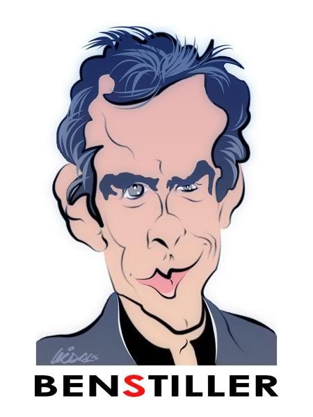
Thanks, everybody, appreciate it. Yeah, the more I tried for exaggeration, the less of a likeness I got, figured the less stretching the better in this case.
|
|
|
|
Post by JC on Feb 13, 2006 19:26:44 GMT -5
I like it dave....great work...he is very tough...i agree with the exaggeration.
|
|
|
|
Post by vtslim on Feb 13, 2006 22:31:36 GMT -5
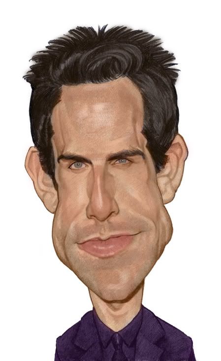
Well Dave I think you're onto something but I have a few comments
-I think you made his upper lip too big and his lower lip too wide
-Something seems unfinished about the eye on our right
I think the drawing is super quality otherwise though!
-Slim
;D
|
|
|
|
Post by toonMom on Feb 14, 2006 6:35:05 GMT -5
Great job Dave. The one eye seemed unfinished to me as well.
|
|
|
|
Post by vidal1951 on Feb 14, 2006 23:46:53 GMT -5
Dave, congratulations. Excellent work. As I am " clos " I have given myself a new opportunity and thanks to your model I have been able to carry out a better version. I wait your opinion.  |
|
|
|
Post by WATCHTHEBIRDY on Feb 15, 2006 5:01:06 GMT -5
|
|
|
|
Post by donpinsent on Feb 15, 2006 9:37:53 GMT -5
really? i still thought #3 was better.
|
|
|
|
Post by dave on Feb 15, 2006 11:26:57 GMT -5
Thanks Everybody, I'm glad for the comments! I see what you mean now about the eye and mouth, Slim, I was getting lazy, but feel like fooling around a bit now that I've been away a while.
Vidal, I like this one best, still has that design quality to it, but makes for a more realistic drawing- keep these up! Glad mine could help!!
|
|
|
|
Post by vidal1951 on Feb 15, 2006 12:18:28 GMT -5
Thank you friends for their words. The previous works were drawings if it didn't achieve a likeness with the pattern. This demonstrates us that the cartoon demands investigation, study to achieve its resemblance the nearest thing possible and also that we should not conform to with the first I draw bad or the exaggerated deformation that we make. There the challenge begins...
Also in this portal of friends, we are to make a mistake and to learn how to correct our errors and to criticize us professionally. A good critic can never become a contempt or jeer.
Not in this true school of the cartoon.
|
|
|
|
Post by vtslim on Feb 15, 2006 14:06:03 GMT -5
Hi Folks! Here's my go...took about five hours or so. -Slim ;D  |
|
|
|
Post by toonMom on Feb 15, 2006 15:22:50 GMT -5
I really like the last one Vidal, great job and way to stick with it.
Nice one slim
|
|
|
|
Post by dave on Feb 15, 2006 16:40:26 GMT -5
Excellent piece of work, Slim! What medium is that, I'd love to try my hand at it? I love the textures!!
|
|
|
|
Post by vtslim on Feb 15, 2006 18:33:39 GMT -5
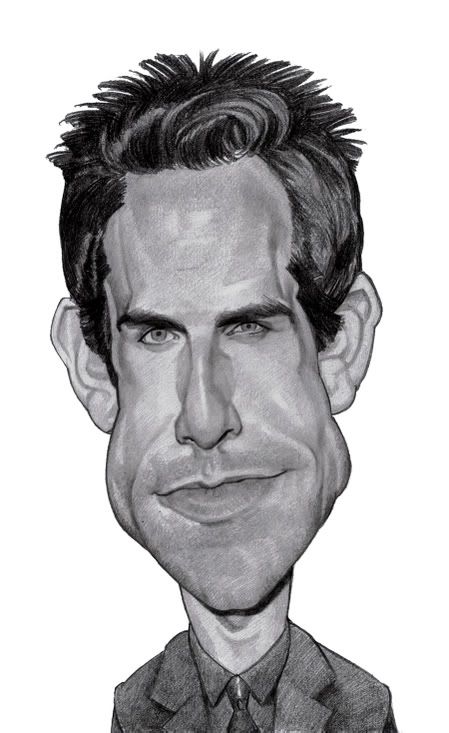
Thanks Dave, I use a Penciltech 2000 and a Papertool XZ6. Actually, I use pencils and paper for the value study. I like it to "feel" sculpted and to have some texture and I can make the pencil do what I want (I use threats) Then scan to the computer and lay on semi-transparent layers of color. I use the erase tool set at 40% opacity to erase from the orange layer to bring out the darkest darks. I still do it pretty much like my color tutorial but I spend more time getting the pencil drawing right and less time on the computer. Here's the pencil sketch... -Slim ;D  |
|
|
|
Post by JC on Feb 15, 2006 20:20:20 GMT -5
SLIM, wow...such a realistic caricature...not sure how to explain it.....detail is outstanding...congrats
|
|
|
|
Post by chrisneuenschwander on Feb 16, 2006 0:57:59 GMT -5
Nice work slim, now thats the way digital should be done, mostly by hand...much more control that way, atleast for me! Ive tried other ways and failed misreably..
-Chris
|
|