|
|
Post by vidal1951 on Feb 9, 2006 2:12:25 GMT -5
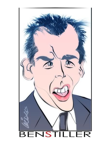
Ben Stiller to the style Vidal.  |
|
|
|
Post by chrisneuenschwander on Feb 9, 2006 4:16:40 GMT -5
Thanks Dave!
Vidal - Honestly, I dont see stiller here at all, maybe its just me, nice technique though! especially like the treatment of the hair. Maybe thinning his face would help, or a different pic?
|
|
|
|
Post by horate on Feb 9, 2006 12:23:50 GMT -5
Vidal cool technique, i like a lot this style !!composition and design is nice,.... about the Stiller face , i think is not here,...maybe in this one the nose is exrtremely too short.good attempt AMIGO.
|
|
|
|
Post by jong on Feb 9, 2006 13:04:44 GMT -5
although it's not totally stiller, i can definitely see some likeness. i really like how you did the hair and the coloring. i think if you had exaggerated the ears more and defined the line a bit better, it would be better over all. the white part under the teeth that is supposed to,i think, represent the tongue, is kind of bothersome. again i like the colors and composition.  |
|
|
|
Post by vidal1951 on Feb 9, 2006 18:00:00 GMT -5
It is a style comic"de agreement to the enclosed picture. He also has a very special face. Thank you for their words, but they are not still true stillers. We found this artist more complicated than others. I´m want that the suggestions present them since graphicated we are visual comunication.  |
|
|
|
Post by drawmyface on Feb 10, 2006 2:23:41 GMT -5
Here's my Stiller: attempts 1 and 2. I think his right eye (our right) is looking in the wrong direction in the second one, I just noticed that now.   btw, Chris, nice job, I like it! Dan |
|
|
|
Post by chrisneuenschwander on Feb 10, 2006 3:45:10 GMT -5
Hey dan thanks! i like yours, it makes me laugh, the second one reminds me of if Ben Stiller and Arnold ever had a child! great work, i think if they were more developed, stiller would jump out more one way or another! youre definatly capable of attaining a likeness!
-Chris
|
|
Neil
Junior Member
  Neil
Neil
Posts: 76
|
Post by Neil on Feb 10, 2006 13:11:03 GMT -5
Here is my second attempt at Ben. I hope ya'll don't get mad at me posting two times. I thought my first need some work. Let me know what you think.  "]=http://imageshack.us] "]=http://imageshack.us] [/url] |
|
|
|
Post by dave on Feb 10, 2006 13:57:38 GMT -5
I like the design on this one, Neil, it almost looks like a postage stamp!
...and NO, nobody's gonna get mad at you for posting twice! You can post as many as you want here, it's encouraged!! You can also go back to previous month's challenges and try out those whenever you like- there's pages of fun people to draw, and enjoy and learn from the great artwork that's there!
|
|
Neil
Junior Member
  Neil
Neil
Posts: 76
|
Post by Neil on Feb 10, 2006 14:11:12 GMT -5
Thanks Dave! I used a little different approach on this on. I used KTP Goo and stretched Ben's face into what I thought it might look like in a caricature. I then used Corel Paint to draw over the image with my Wacom Tablet and then I colored in the areas and added shading. I know it kinda seems like cheating, but I hope it gives me some idea of how to play with facial features and hopefully I can transfer that to free hand drawing soon. Thanks for being so helpful and encourging to all of us newbies.
|
|
|
|
Post by chrisneuenschwander on Feb 10, 2006 14:19:07 GMT -5
neil, looks good, but i have one question after reading your post...why are you trying to learn how to draw through digital art? I would think that more benifit would be had if you just drew freehand day after day after day, then moving into digital. just simple little pencil sketches, or even pen, youd be amazed hom, much improvement you have in a short period of time (dont expect this over night!) just my opinion, you get more detail and more control when you are drawing freehand, rather then with a tablet...maybe thats just me...
-Chris
|
|
|
|
Post by toonMom on Feb 10, 2006 16:37:00 GMT -5
Keep trying and keep posting Neil! I have to second what Chris said, draw freehand. There is no benefit in tracing over an image. No another one, freehand this time and show us what you come up with!
|
|
|
|
Post by horate on Feb 10, 2006 21:05:13 GMT -5
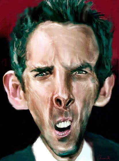
Neil good one, here a digital painting try   |
|
|
|
Post by vidal1951 on Feb 11, 2006 1:46:08 GMT -5
BEN STILLER2  |
|
|
|
Post by dave on Feb 11, 2006 12:29:00 GMT -5
a great technique and distortion, Horate, I really like this!
cool design, Vidal, nice graphic
Neil, I agree with everyone else, do more pencil sketching, post your efforts somewhere on the site, dont be shy, and we can all discuss them!
|
|