|
|
Post by horate on Feb 11, 2006 16:27:40 GMT -5
thanks Dave, 6 hours aprox on this.
Vidal i think in this one the problem are eyes.anyway i think the basic problem is the liquify filter, the exageration elected is bad.maybe try to sketch on paper before, to study the face better.
|
|
|
|
Post by vidal1951 on Feb 11, 2006 21:25:05 GMT -5
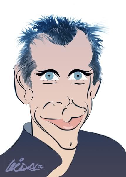
Thank you Dave, but it doesn't satisfy me completely. BEN STILLER3, drawn and painted in photoshop with the feather tools and paintbrush, although some that, they know a lot they continue believing that I use filters... Niall. it is better to draw with the feather and the line automatically is fixed in the paths, you erase it and you continue, then on that base in another layer put him the color. You couple the layers and finish.  |
|
|
|
Post by horate on Feb 11, 2006 22:21:53 GMT -5
Vidal this one is better than the 2 others , the egyptian eyes and mouth are better like that, congrats for this advance, and i like more this style cause is not blured.
I know that you use the liquify filter, cause i know how you have made this caricature, the original photo was treated with diferent layers, the real hair was smudged, the face was liquify, and then you paint over the face in other layer.the original color of the photo was changed using color balance and hue saturation.
Now the Liquify is a problem when this filter move away the likeness of the original pic, that´s all.
|
|
|
|
Post by makarand on Feb 11, 2006 22:28:36 GMT -5
Good try by everyone. He is the most difficult subject I ever did.  |
|
|
|
Post by vidal1951 on Feb 12, 2006 0:50:12 GMT -5
BEN STILLER 4 |
|
|
|
Post by vtslim on Feb 12, 2006 10:32:30 GMT -5
Hey Folks! Ben Stiller, eh? Looks challenging! I think Makarand's drawing is the only one with a real likeness so far, sorry people. I find if I do a portrait of a challenging face I will become familiar with the angles, folds, and forms and stretching them to make it a caricature becomes easier. Either that or I find a way to block out the details. I either hang the picture across the room or I squint. I try to pick out the essentials and stress them.
-Slim
;D
ps...actually Dan's is a good likeness too and while I think Chris's version could be a stronger likeness I really dig the style and drawing!
|
|
|
|
Post by makarand on Feb 12, 2006 11:45:21 GMT -5
Thanks Slim, yeah! it’s tough, it doesn’t seem though. But as we start drawing him we realize he is not easy. I didn’t want to quit anyway, I really struggled to find the like ness and it took more than 20 drawings to get this result, finally!!!
Craig also got very good like ness. Horate, Dan & Chris did good job. Vidal is close, I like his coloring technique.
|
|
|
|
Post by horate on Feb 12, 2006 20:49:45 GMT -5
Mak good one i like the grotesque face, even i found a little static movement.
Go on Slim, we are waiting for your detonation,....by the way,,,.....are sure you are the detonator man ???hehehhee....come on man,... just do it !!!
squeeze .....
|
|
|
|
Post by donpinsent on Feb 13, 2006 11:21:19 GMT -5
vidal, i think #3 is much superior to #4. better likeness all around. the only problem i see with #3, in fact, is the eyes. ben's eyes are not symmetrical. look at the photos again. his right eye is narrower than his left in every picture! except the squinting ones. what's weird to me is that you're not the only one to miss that, despite the fact that someone specifically pointed it out earlier in the thread!
|
|
|
|
Post by dave on Feb 13, 2006 13:13:59 GMT -5
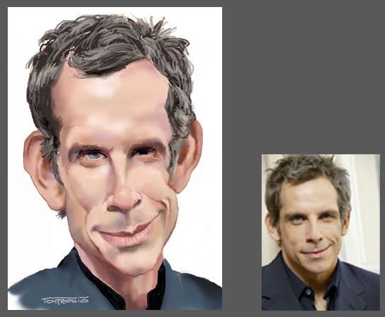
After 3 bad attempts, I went to the site Craig listed and found this photo, there's some real good ones there... This is what I finally came up with... Ben was pretty tough, WHO CAME UP WITH THIS GUY, ANYWAY?  ?  |
|
Neil
Junior Member
  Neil
Neil
Posts: 76
|
Post by Neil on Feb 13, 2006 13:35:24 GMT -5
Dave you nailed it! You really have a gift for this. I wish I could learn one on one with some of you guys. I have been working on some new stuff, but I still think I draw it to to realistically. I am going to take the online course that toonmom suggested as soon as my next payday rolls around. Maybe then I won't use the paint program as a crutch.
|
|
|
|
Post by nelsonsantos on Feb 13, 2006 15:34:48 GMT -5
think yous is the closest Dave but you sticked too much to the pic that it turned more like a portrait.
|
|
|
|
Post by lightshifter on Feb 13, 2006 16:36:21 GMT -5
As usual you rock,
|
|
|
|
Post by horate on Feb 13, 2006 16:40:27 GMT -5
yes Nelson in this kind of faces, a caricature is in sort way the portrait,... good technique Dave and nice job, but i think it could be a litle more played, i mean about the proportions of face, seeing far example his long nose. ..nice colors as ever !!
|
|
|
|
Post by makarand on Feb 13, 2006 16:49:33 GMT -5
You've got him Dave. For this subject little bit exaggeration is good enough ;D
Nice coloring.
|
|