|
|
Post by toonMom on Aug 1, 2006 7:00:58 GMT -5
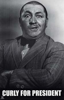
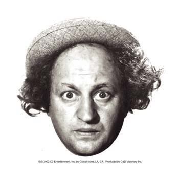
For this month... the 3 stooges.    Do any, or all of the stooges. |
|
|
|
Post by horate on Aug 1, 2006 12:21:17 GMT -5
oh yea Mom, ...good idea, i like the challenge, the 3 stooges,Don as Moe , Me as Curly, and Light as Larry ?? or not ??
|
|
devro
Junior Member
  ALL YOUR BASE ARE BELONG TO US!
Posts: 90
|
Post by devro on Aug 1, 2006 16:20:43 GMT -5
Its hard to caricature faces that already are caricatures  dev |
|
|
|
Post by aardvark on Aug 9, 2006 2:17:57 GMT -5
Not 100% happy with these, and they didn't photograph too well, but here they are anyway. One more to do later.   |
|
devro
Junior Member
  ALL YOUR BASE ARE BELONG TO US!
Posts: 90
|
Post by devro on Aug 9, 2006 13:54:02 GMT -5
nice try, but i think theyt look more like portriats. Maybe try exaggerating more?
devro
|
|
|
|
Post by aardvark on Aug 9, 2006 18:13:53 GMT -5
Thanks. To be honest, I initially drew Larry with a fair bit more exaggeration, as you can see in my first drawing of him below. I didn't think it looked right, so I changed it. I thought I'd try doing the 3 of them with a little bit of exagerration, (ie: Larry's slightly more bulbous nose and rounder eyes, and Curly's very crooked mouth and chin and eyes that are all over the shop) but do them in a portrait style so that you didn't really notice the exagerration. I don't know if I pulled it off? Now that I've pointed out what I've tried to do if you go back and take another look maybe the exaggeration will be more obvious? Maybe not? Maybe I should have finished this drawing off?? Maybe I'll modify Curly a little more....  |
|
|
|
Post by jong on Aug 10, 2006 4:23:14 GMT -5
hey aardvark, good job! both your first (the first one you drew) and second larry are great. the first has more obvious exaggeration.. the only real exaggeration i see on the second one is that you gave him smaller pupils then in real life. on the second one, if you wanted more exaggeration you could give him a bigger nose like you have on the first, give him a bigger forehead, and maybe smaller chin. you've chosen the right things to exaggerate though, and you've got a great likeness there on both. the first larry is really funny. you could have maybe given him a little different eyeshape..not quite as round. if you weren't satisfied with the first you could try something inbetween the first and second. some people like very obvious exaggeration, others like to keep things a bit more subtle. i can definitely see exaggeration on curly, but i don't see very much likeness. the first thing is the mouth.. at first i thought you had drawn it closed.. only after looking carefully did i see it was actually drawn opened. if i look at it as closed the whole expression of curly is totally changed. you need to do something about that i think. another thing is that you gave him a bigger forehead than he has... i personally think he has quite a small forehead. our left eye should also be higher.. right now it's lower than the right one..if anything it would be the other way around. the relationship/distance between the eyebrow and eye on the right isn't quite right either. one last thing, his ears hardly stick out, unlike you've drawn them. okay, i'll shut up now. ;D i'm not at all trying to tear you or your drawing apart.. i'm just giving some pointers that, imo, would improve the likeness. these may all seem like nit-picky things, but i think it's all these small things that give a likeness. keep it up! and great job on larry.  |
|
|
|
Post by aardvark on Aug 10, 2006 8:56:46 GMT -5
I hate for this first page to be all about me, but since no-one else has submitted anything.... Jong, thanks for the advice! Please don't feel like you need to stop criticising just because you feel you are being a little harsh. It's this sort of criticism that is helping. I tried to fix the drawing of Curly I had already done, but it ended up looking like a mess. So, I redrew it. I've also attached my shot of Moe. I'm not 100% happy with it, but I rushed it a bit. I've been off work all week with a work related injury, so I've had plenty of time to sit here and scribble away. I'm sure the rest of you probably have lives or something.    |
|
devro
Junior Member
  ALL YOUR BASE ARE BELONG TO US!
Posts: 90
|
Post by devro on Aug 10, 2006 11:29:28 GMT -5
these are looking better. I have a question though. Do you use a tortilon? Its used for blending and really helps with shading. They are just basically rolled up paper and you rub it on the grapite and it smears the lines and makes the shading appear more reallistic. they cost next to nothing and dont hurt to try.
devro
|
|
|
|
Post by jong on Aug 10, 2006 15:12:34 GMT -5
wow, the second curly is A LOT better!! i think that i could easily recognize it as him. great job.   i like your moe a lot too! i wouldn't have exaggerated his hair vertically like you did though, because, as far as i can tell, he doesn't have a big forehead ( not that i can see his forehead, but the top of his head, you know what i mean don't ya!?)..it looks like at first you didn't do that but later decided to go over it with the pencil to give him a bigger forehead area. i think the bottom of the face could be drawn down more.. the chin and and the space between his mouth and bottom of the nose. besides that i think it looks cool. |
|
|
|
Post by horate on Aug 10, 2006 17:59:10 GMT -5
Hi Devro, i prefer to use the finger without tortilon, i feel better touching, and caressing without strange things, and for me the blend works better, is more intense.
Aardwark, i like the first Larry and the 2º Curly.Moe is good but i think could be better.Maybe i think you can surprise us with some colors over, only an idea.Anyway your advance is notorious.
|
|
|
|
Post by aardvark on Aug 10, 2006 20:42:16 GMT -5
Like Horate, I use my finger. Heck mate, I'm still using a HB pencil I found in the kitchen draw!! What are the advantages of a totilon over the end of one of my pointy bits of flesh? it looks like at first you didn't do that but later decided to go over it with the pencil to give him a bigger forehead area. Hahahaha... that's exactly what I did. I drew his hair, and then I thought, hmmm, I might make it BIGGER!! If I had known it was going to turn out like it did, I probably wouldn't have done it. Maybe i think you can surprise us with some colors over, only an idea.Anyway your advance is notorious. Colours? I've only been using a lead pencil for 2 months. I don't think I'm ready to try using coloured pencils yet. I did try using Paint Shop to colour in one of my other drawings. Using a mouse it just takes too long and doesn't look any good. Thanks to everyone for their advice! I couldn't do this without you guys. Hopefully my pictures for this challenge have encouraged the rest of you to stop procrastinating?  |
|
|
|
Post by andysarts on Aug 12, 2006 13:31:46 GMT -5
Ok heres my go at them, i hope no one minds but i used a differnt pic for lenny...BTW yuo gotta click the pic to see the larger version...  |
|
|
|
Post by makarand on Aug 29, 2006 10:38:27 GMT -5
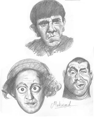
Here is my go by the end of the month. I don't see any post here for more than two weeks. To draw a caricature of caricature face doesn't seem so exiting....   Thanks, Makarand |
|
|
|
Post by aardvark on Aug 29, 2006 10:50:54 GMT -5
I think I've been out stooged!!!! Excellent work Makarand. I love the shading and your Curly made me chuckle.  |
|