|
|
Post by donpinsent on Nov 3, 2004 22:22:25 GMT -5
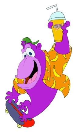
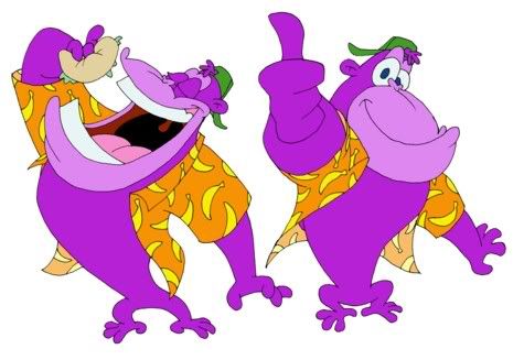
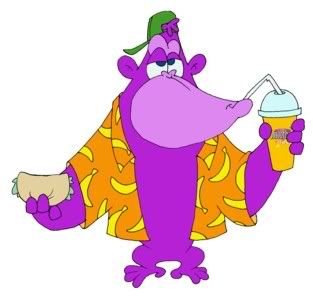
twice in the last couple of months, people i know have opened new restaurants and hired me to design them a mascot. one (a sandwich cafe in london, england) i won't bother showing you my design for, since it's really nothing spectacular. the style they specified is really quite bland and i'm not thrilled with the final product. the other, however, i was pretty much given free reign on and i had a lot of fun with it. it was a pitas and smoothies restaurant in sudbury, ontario, and the guy wanted a purple cartoon gorilla. this was the design i gave him. any critiques won't be unwelcome, but they won't be of any real use either, since the client has already paid and put the designs on display in the restaurant. just so you know. all the same, feel free to tell me your opinions.     |
|
|
|
Post by Draw4You on Nov 4, 2004 8:10:17 GMT -5
Don this is some great work here. I think its top work! I would have never thought of a simple body like this for a gorilla, and it is perfect. Me I would have made it more complicated. These guys must be happy with the work. Mike N.  |
|
|
|
Post by donpinsent on Nov 4, 2004 9:47:05 GMT -5
thank you very much. yeah, the client was very pleased. these are very similar to the initial sketches i sent him, because he gave very few and minor requests for revisions on them. actually, i drew about a dozen different gorillas before deciding on this one (which is largely made up of components from several of the earlier versions), and some of them were much more comlicated than this, where i was trying to draw a more realistic gorilla body. ultimately i decided he would have more mass-appeal if i made him much more cartoony and simple.
|
|
|
|
Post by corky on Nov 5, 2004 20:24:36 GMT -5
"ugh...not bad for a human. stoontoons says it's good, but what does she know about monkeys? ooh, sooorrrryyy....primates....like they're the higher species or something....if you don't have a tail, you're not evolved!"
(sound of stoontoons pushing angrymonkey roughly off the computer desk...grunts, moans, and slaps can be heard).... ;D
|
|
|
|
Post by dedder on Nov 6, 2004 13:44:25 GMT -5
I LOOOOOOOOOOOOOOOOOOOOOVE IT!
would animate very nice !
|
|
|
|
Post by itsadam on Nov 6, 2004 19:16:04 GMT -5
Great Stuff Don!
It reminds me of a style I just cant put my finger on. Great use of colours and the poses are fantastic
|
|
|
|
Post by donpinsent on Nov 6, 2004 19:52:29 GMT -5
the style you're thinking of just might be hanna-barbera. waaaaaaaaaaay back when i first started putting pencil to paper, hanna-barbera cartoons were my greatest inspiration, and i believe their influence still shows through in much of my cartooning today.
thanxalot for the compliments, everybody. except stoontoons's monkey. why, i oughtta....
|
|
|
|
Post by itsadam on Nov 6, 2004 20:35:41 GMT -5
Yep Hanna-Barbera. It definately shows in your work. As Hans said, it would look great animated.
|
|
|
|
Post by donpinsent on Nov 8, 2004 8:44:17 GMT -5
thanx. i approached this project comsciously trying to make them animatable (try finding THAT word in webster's!), almost as if i were creating a character model sheet for a animated production. given my training, that's kind of automatic instinct for me now. glad you feel it worked.
|
|
|
|
Post by Mauri on Nov 18, 2004 8:28:38 GMT -5
Don don don, Wow, I love this design. Wonderful line work aswell as the color job. Never have been to good a cartoons. I think you have a talent for simplifying things (deceptively simple) I have such a hard time doing that with cartoons. Your work reminds me of a good friend of mine I worked with a Universal Studios.. www.eddiepittman.com/ I think you will like his work. Let me know what you think.. Talk with you soon friend, Mauri |
|
|
|
Post by donpinsent on Nov 19, 2004 8:22:43 GMT -5
wow, thanx mauri. i just checked out eddie's portfolio, and i have to say that it's surely an overstatement of my talent to compare me with him! both his cartooning and his reality drawings could be studied for hours!
|
|