|
|
Post by donpinsent on Feb 2, 2008 12:50:57 GMT -5
okay, i have no idea what you're talking about. but anyway, the shading on ahderson cooper is, like you said, blurred. it was intended as a quick sketch, not a finished work. i did the whole thing in about 20 minutes.
|
|
|
|
Post by donpinsent on Feb 7, 2008 12:50:47 GMT -5
getting close to the end of the week now, but i finally have my "c" female. it took me along time, for various reasons i won't bother going into in detail. suffice it to say, it took me a long time to decide on a subject, and then i struggled for a long time with the actual drawring. but i think the final result is pretty good. feel free to disagree. it's jennifer connelly. 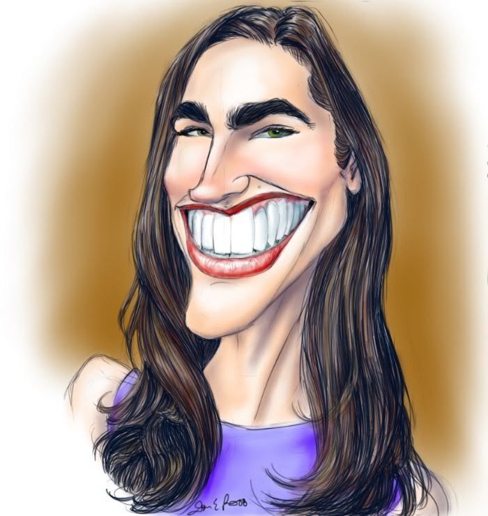 |
|
|
|
Post by donpinsent on Feb 12, 2008 12:16:53 GMT -5
one of the few things i don't like about about sketchbook pro is that, while you can create very realistic pencil-tip lines, there's no way to simulate using the side of a pencil lead for shading (at least, not that i've discovered. if anyone knows differently, please do explain it to me). hence, i am not really pleased with the shading on this one, but wasn't really able to take the time to use the airbrush tool as i usually do. anyway, here, partly inspired by kaya's shot at him, and partly because he's the subject of the current contest at denis grand's website, is matt damon. 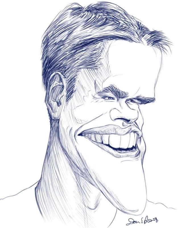 |
|
|
|
Post by toonMom on Feb 13, 2008 17:28:24 GMT -5
Nice work Don! I tried him once and he wasn't easy to capture (for me anyway). I think you did a really nice job on the likeness. The shading doesn't really bother me, but I can see what you are talking about. For me the lines add to the drawing.
|
|
|
|
Post by donpinsent on Feb 15, 2008 10:41:38 GMT -5
thanx, toonmom.
|
|
|
|
Post by horate on Feb 16, 2008 11:47:27 GMT -5
Sorry too or less lines are the prob Don.On the Girl they are too rough, on the boy the effect is good, but the construction is deformed, with a notorious mistake at our right eye.I see claerly the likeness on both, but pay attention on your drawing cosntructuction, it.s very important part of.
|
|
|
|
Post by donpinsent on Feb 16, 2008 14:13:00 GMT -5
rough lines are because it's just a sketch, not a finished work, and the construction you call a problem is intentional exaggeration of his massive forehead coming down over his eyes. thanx.
|
|
|
|
Post by horate on Feb 22, 2008 14:51:02 GMT -5
Damon is wierd, i don´t see the intention, maybe i see a defromation created before.I prefer the lines you use on Damon, it give more a sketch effect, and anyway, Conelly the color with volumes so clean, give not a sketch effect, to me is a colored drawing.
|
|
|
|
Post by donpinsent on Mar 4, 2008 19:46:36 GMT -5
had i intended connelly to be a finished piece, i would have gone to a lot more effort at realism in the colouring job, and would have eliminated the linework altogether. this is a sketch. anyway, on to the next one (finally). the reason i'm so late with the next installment actually has nothing, surprisingly (to me), to do with laziness or forgetfulness, which i expected to be my biggest roadblocks. i don't want to bother with a lot of details, but suffice it to say that i usually do these during lunch breaks at work, but recently found myself quite suddenly thrust into a temporary layoff situation, so the opportunity to work on them hasn't presented itself as often. so this one's two weeks late ( i believe), and the next few will be tardy as well, but then after that, i'll be back at work, and i'll start doing one or two a week until i get back on schedule. in the meantime, "d" is for desperate housewives. 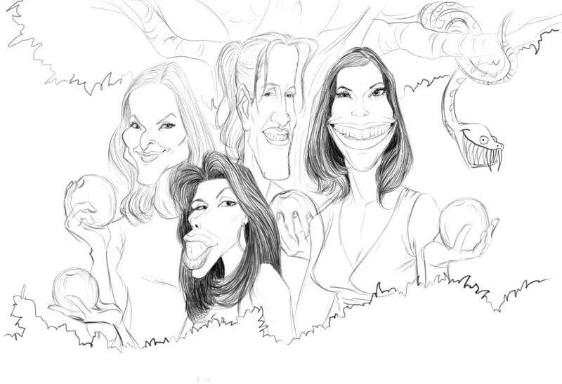 |
|
|
|
Post by toonMom on Mar 7, 2008 7:23:09 GMT -5
I really like this one. It is a bit different from your usual layout. I think you made up for your tardiness with drawing all four. Great likeness on all of them. Here are my next 2 (late as well) for B Adrien Brody 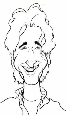 Barbara Walters 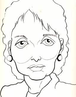 |
|
|
|
Post by horate on Mar 8, 2008 9:46:19 GMT -5
Don i like this drawing, i don´t know the girls, but outlines are fine.I prefer this humble drawing, not the digital retouchement you apply later.I think it is most honest this way, you know, is more real.
|
|
|
|
Post by donpinsent on Mar 24, 2008 20:30:39 GMT -5
okay, finally, i send you my "e" male. i tried to make up for being so late last time by doing a caricature of four people in one. this time, i'm attempting to make up for it by doing a full-blown, full-colour finished piece. the logic doesn't really work out, though, because part of the reason i'm so late with this one is because i was putting time into doing a full-blown, full-colour finished piece. whatever. "e" is for edgar allen poe. 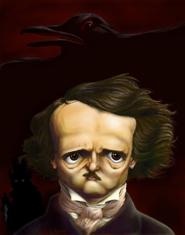 |
|
|
|
Post by doccramer on Mar 25, 2008 6:02:47 GMT -5
Edgar was worth waiting for, Don. It's an unstatement to say this is really nice work.
|
|
|
|
Post by donpinsent on Mar 25, 2008 7:58:25 GMT -5
wow, thank you. i'm very happy with it, except i'm thinking i may replace the lurking stabber guy in the background with something subtler and creepier. i don't know yet what that would be, though. any suggestions, anyone?
|
|
|
|
Post by horate on Mar 25, 2008 14:51:54 GMT -5
very nice Don, color and shadows, i`m not sure if he is eating something like potatoes, but expression of eyes is really sweet.
|
|


