
Post by donpinsent on May 10, 2006 9:51:29 GMT -5
okay, here, finally, after several requests a long time ago, is a step-by-step demonstration of the way i use coloured pencils to add colour to my caricatures. i'm certainly not suggesting that this is the only method anyone should use, but it's been working okay for me. if anyone has suggestions how i could improve on this process, i'd be glad to hear them.
i also have to allow for making changes as i see necessary at any time along the process, so in some cases, you'll probably notice slight changes made beyond those i've outlined in my descriptions here.
here we go:
step 1. the sketch. i sketch out the caricature on 11" x 14" paper. it doesn't matter how rough it is, or what i use to draw it with, since this isn't even the page the final colours will actually go on.
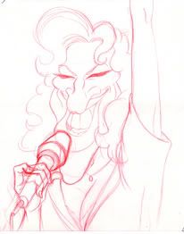
step 2. i use very low-tack scotch tape in two corners to tape another sheet of paper overtop my sketch. this is so that the final drawring will have no solid outlines. i lay down a layer of a light yellow pencil (i use prismacolors, and in theirs the colour i use is called "sand") to trace over all the skin, and, in this case (because she's blonde), hair, and colour it all in in shades (ie. darker in the shasowed areas, leaving it white in the highlighted areas). at this stage, anything that isn't going to have that base yellow shades, such as eyes and teeth, are left alone.

step 3. at this stage, i usually do the same as i did in the "sand" colour, with either "blush pink" or "mineral orange", depending on which seems to be the more prominent shade in the individual's skin tone. usually (but not always), it's pink for women, orange for men. in this case, it was pink. again, i leave all white parts untouched, as well as a small area around the white highlights, so that there will be a yellow area surrounding the white.
step 4. now i use the other of those two colours, in this case, the "mineral orange", doing essentially the same thing, but putting only very little orange on the areas that should be more pink, such as nose, cheeks and, um.... you know.... those.
step 5. now i blend those pink and orange colours together by going over it all again with the "sand".
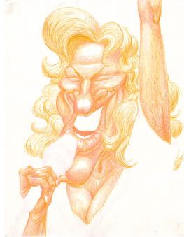
step 6. i now start adding strength to the shadows, using "burnt ochre", a light, slightly yellowish brown.

step 7. i go over the darker shadow areas with "sienna brown", a somewhat darker shade of brown.
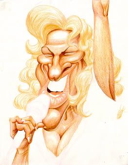
step 8. then, the darkest areas of shadow with "dark brown", a.... dark, um... dark brown. also, i use "magenta" to darken the shadows in those pink areas (nose and cheeks).

step 9. lips. if i'm drawring someone who's not wearing any make-up, i usually stick to just the "blush pink", with "magenta" in the shadows and a combination of "dark brown" and "black grape" in the deepest shadow areas. here, however, i wanted to give bette a bright, obnoxious red lipstick. so i used "crimson lake", with "black cherry" in the shadows. notice that i've left the areas immediately surrounding the white highlights pink, though. also, i've added more shadow inside the mouth.

step 10. now i add shading to teeth and the whites of the eyes. one great thing about prismacolors is the way they handle greys. they have three different types of grey: "cool grey" (which has a slightly bluish hue), "warm grey"(which leans more towards reds) and "french grey"(a brownish grey) . and then, within each of those, they have varying degrees of the grey in question. for example, there is a "cool grey 10%", which is just a little off-white, then "cool grey 20%", which is a bit darker, and so on, up to "cool grey 90%", which is just barely not black. this makes shading black-and-white drawrings, or areas such as the teeth and eye whites in colour drawrings, quite simple. here, i used the "cool grey" scale, sticking to 10%, 30%, 70% and, in the deepest shadows (only very small areas, since the overall effect is still suppoesed to communicate "white" to the viewer), 90%.
oh, and i also did the blue irises of her eyes at this point, using "deco blue" (a very light blue) over the whole area. then using "blue slate"( a greyish blue) for mid-shadows, and for drawring in the lines that radiate from the pupil out to the outside edges of the irises, then "indigo blue" and "cool grey 70%" in the darkest shadow areas. and solid black for the pupils. again, note that i've left a small white highlight as well (though actually, at the size this image appears here, that may or may not be noticeable).

step 11. now i start detailing the hair more, using "yellow ochre"(a shade of yellow that starts to lean towrd brown), "burnt ochre", "light umber" and, for deepest shadows, "dark umber". i try to do hair in blocks of colour first, then using lines of the different colours, curved in the directions i want the hair to flow, within those blocks, and around tyhe edges of the blocks so that they aren't quite so obviously separated one from another. i don't know whether i'm describing that clearly. it may have been easier to understand had i shown this part in more broken-down steps, but.... oh well, what's done is done.

step 12. now i go back and do the eyelashes, in solid black. the reason i waited until after the hair was done to do this was because i didn't want the black of the eyelashes to be smeared when i drew the colours of the hair ight through it. also, it was, for some reason, not until this stage that i noticed that i didn't have enough difference as i would have preferred between the hair colour and the skin colour. so i went over all the skin areas again with the blush pink.

step 13. for some reason (again), id didn't notice until i had started colouring her clothes that i hadn't given the hand holding the microphone a shadow! so i added it at this point using the "dark brown", then blended it more with the skin tone by going over the outside edges of the shadow with "sand", "blush pink" and "mineral orange". this also led me to notice that i didn't have quite the level of contrast i wanted in the skin tones, so i went back and darked the shadowed areas further.

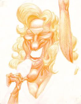
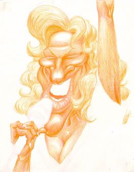
step 14. clothes, mic and background. i got the sequin effect here by colouring the dress in small circles, then going over the highlight areas with small dabs of white acrylic paint, clustering the dabs more in the heavily highlighted areas, and keeping them more spaced apart elsewhere.
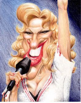
and there you have it. again, i wouldn't mind hearing suggestions for ways you believe my technique could be improved. but in the meantime, i hope i've helped somebody in some small way with all this.
i also have to allow for making changes as i see necessary at any time along the process, so in some cases, you'll probably notice slight changes made beyond those i've outlined in my descriptions here.
here we go:
step 1. the sketch. i sketch out the caricature on 11" x 14" paper. it doesn't matter how rough it is, or what i use to draw it with, since this isn't even the page the final colours will actually go on.
step 2. i use very low-tack scotch tape in two corners to tape another sheet of paper overtop my sketch. this is so that the final drawring will have no solid outlines. i lay down a layer of a light yellow pencil (i use prismacolors, and in theirs the colour i use is called "sand") to trace over all the skin, and, in this case (because she's blonde), hair, and colour it all in in shades (ie. darker in the shasowed areas, leaving it white in the highlighted areas). at this stage, anything that isn't going to have that base yellow shades, such as eyes and teeth, are left alone.
step 3. at this stage, i usually do the same as i did in the "sand" colour, with either "blush pink" or "mineral orange", depending on which seems to be the more prominent shade in the individual's skin tone. usually (but not always), it's pink for women, orange for men. in this case, it was pink. again, i leave all white parts untouched, as well as a small area around the white highlights, so that there will be a yellow area surrounding the white.
step 4. now i use the other of those two colours, in this case, the "mineral orange", doing essentially the same thing, but putting only very little orange on the areas that should be more pink, such as nose, cheeks and, um.... you know.... those.
step 5. now i blend those pink and orange colours together by going over it all again with the "sand".
step 6. i now start adding strength to the shadows, using "burnt ochre", a light, slightly yellowish brown.
step 7. i go over the darker shadow areas with "sienna brown", a somewhat darker shade of brown.
step 8. then, the darkest areas of shadow with "dark brown", a.... dark, um... dark brown. also, i use "magenta" to darken the shadows in those pink areas (nose and cheeks).
step 9. lips. if i'm drawring someone who's not wearing any make-up, i usually stick to just the "blush pink", with "magenta" in the shadows and a combination of "dark brown" and "black grape" in the deepest shadow areas. here, however, i wanted to give bette a bright, obnoxious red lipstick. so i used "crimson lake", with "black cherry" in the shadows. notice that i've left the areas immediately surrounding the white highlights pink, though. also, i've added more shadow inside the mouth.
step 10. now i add shading to teeth and the whites of the eyes. one great thing about prismacolors is the way they handle greys. they have three different types of grey: "cool grey" (which has a slightly bluish hue), "warm grey"(which leans more towards reds) and "french grey"(a brownish grey) . and then, within each of those, they have varying degrees of the grey in question. for example, there is a "cool grey 10%", which is just a little off-white, then "cool grey 20%", which is a bit darker, and so on, up to "cool grey 90%", which is just barely not black. this makes shading black-and-white drawrings, or areas such as the teeth and eye whites in colour drawrings, quite simple. here, i used the "cool grey" scale, sticking to 10%, 30%, 70% and, in the deepest shadows (only very small areas, since the overall effect is still suppoesed to communicate "white" to the viewer), 90%.
oh, and i also did the blue irises of her eyes at this point, using "deco blue" (a very light blue) over the whole area. then using "blue slate"( a greyish blue) for mid-shadows, and for drawring in the lines that radiate from the pupil out to the outside edges of the irises, then "indigo blue" and "cool grey 70%" in the darkest shadow areas. and solid black for the pupils. again, note that i've left a small white highlight as well (though actually, at the size this image appears here, that may or may not be noticeable).
step 11. now i start detailing the hair more, using "yellow ochre"(a shade of yellow that starts to lean towrd brown), "burnt ochre", "light umber" and, for deepest shadows, "dark umber". i try to do hair in blocks of colour first, then using lines of the different colours, curved in the directions i want the hair to flow, within those blocks, and around tyhe edges of the blocks so that they aren't quite so obviously separated one from another. i don't know whether i'm describing that clearly. it may have been easier to understand had i shown this part in more broken-down steps, but.... oh well, what's done is done.
step 12. now i go back and do the eyelashes, in solid black. the reason i waited until after the hair was done to do this was because i didn't want the black of the eyelashes to be smeared when i drew the colours of the hair ight through it. also, it was, for some reason, not until this stage that i noticed that i didn't have enough difference as i would have preferred between the hair colour and the skin colour. so i went over all the skin areas again with the blush pink.
step 13. for some reason (again), id didn't notice until i had started colouring her clothes that i hadn't given the hand holding the microphone a shadow! so i added it at this point using the "dark brown", then blended it more with the skin tone by going over the outside edges of the shadow with "sand", "blush pink" and "mineral orange". this also led me to notice that i didn't have quite the level of contrast i wanted in the skin tones, so i went back and darked the shadowed areas further.
step 14. clothes, mic and background. i got the sequin effect here by colouring the dress in small circles, then going over the highlight areas with small dabs of white acrylic paint, clustering the dabs more in the heavily highlighted areas, and keeping them more spaced apart elsewhere.
and there you have it. again, i wouldn't mind hearing suggestions for ways you believe my technique could be improved. but in the meantime, i hope i've helped somebody in some small way with all this.


