|
|
Post by lightshifter on Jan 25, 2007 15:00:14 GMT -5
hey toonmom
The hands sort of dissapear and that area draws my eye immediately. The dress is great and becomes the major focus for me.Depending on what you are trying to accomplish. If the figure and the caricature are your main objective I think this is not up to par of a lot of your efforts. jmo
|
|
|
|
Post by chrisneuenschwander on Jan 25, 2007 17:18:15 GMT -5
Hey! some new Hillarys!
well ,andy, i must say that this is probably the best one ive seen you do, with that said, I sitll dont think its too amazing. It looks kinda like youve drawn it 100% on the computer, and honestly, I dont think much progress can come that way. Plus you have several "shading" errors, such as teh checks getting darker where there should actually be a highlight. Anywho, its still a good effort, those are just my 2 cents, take it or leave it...
and toonmom! great to see you posting again! The body looks good, but it doesnt match the head...but I like what you did with the flowing dress! and the likeness is descent, but wheres her elbow?! anywho, looks good, hope to see more from you now, getting back into the swing of things myself affter the holidays...
-Chris
|
|
|
|
Post by andysarts on Jan 26, 2007 13:25:58 GMT -5
Thanks for the comments chris i really apreciate it, unfortuantly i have to admit it was all done on the PC i've been so digital quite recently with photography & things i have totally forgetten how to drawn, the matrix was the only drawing to date that wasn't PC Drawn.  |
|
|
|
Post by toonMom on Jan 26, 2007 18:46:05 GMT -5
Thanks for the comments. Now I must explain the assignment as this was done for a class project in digital design I. The assignment was to combine a hand drawn image with a scanned image of a photo. I had drawn the Hilary sketch but hadn't finished it enough to post it so I thought I would use that as my hand drawn image. The body was scanned from a magazine. After I combined the two and digitally colored the face, my professor started asking questions about what kind of statement I was making with it and what people would get from it. From there I faded the scan of the dress and drew some lines on it in photoshop. The reason I decided to use the scan of the dress is because we all know I don't draw bodies. That said, I doodled a bunch of bodies in class today (a mail art class with too much debate about what words mean).
|
|
|
|
Post by flatcap on Jan 27, 2007 5:53:49 GMT -5
andy good likeness, and i can see you have conveyed the facial expression that is in the source photo in to your drawing well done. I agree with chris with the points he made put them in place and it would take your pic to another level.
|
|
|
|
Post by flatcap on Jan 27, 2007 5:57:42 GMT -5
toonmom, i think you got a fair likeness with very few lines which is not easy well done.
|
|
|
|
Post by toonMom on Jan 27, 2007 8:41:23 GMT -5
Thanks Flat!
|
|
|
|
Post by JC on Jan 31, 2007 21:14:05 GMT -5
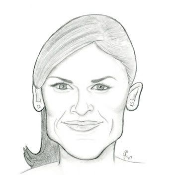
it has been way too long...sorry for not being a part of all the drawing over the last 6 months. I have been drawing...here is my swank....  |
|
|
|
Post by toonMom on Feb 1, 2007 13:41:40 GMT -5
Nice JC! It's good to see some new work from you. I see improvements everywhere! Your linework looks terrific and the likeness is dead on. Great job!!
|
|
|
|
Post by chrisneuenschwander on Feb 1, 2007 18:07:50 GMT -5
agreed, great likeness, bu tnot a big fan of the solid line around her face, would be a better drawing if the lines where uniform. Its a great improvment! and one of the betters ones posted this month!
-Chris
|
|
|
|
Post by flatcap on Feb 2, 2007 6:33:30 GMT -5
great likeness, and really good eyes.
|
|
|
|
Post by horate on Feb 3, 2007 19:40:06 GMT -5
hi jC, yep, great likeness, and clean technique.recently i have discover a new way to sketch, with graphite, is to take the pencil with the exteme of fingers and begin sketching with thin lines, moving the hand like a WINDSHIELD.before that, i made the bold lines.
|
|
|
|
Post by vidal1951 on Mar 12, 2007 11:20:13 GMT -5
 Dear colleagues and friends, I present to Hilary Swank to the style Vidal. I clarify that it is not a fotocaricature. It is an illustration carried out in Illustrator and photoshop. I wait their comments. A hug, Vidal |
|
|
|
Post by andysarts on Mar 12, 2007 12:36:37 GMT -5
ZOMG, this is awsome i totally love this style..
|
|
|
|
Post by vidal1951 on Mar 12, 2007 14:42:50 GMT -5
andysarts, thanks for yours words. I like me, too and are find a very line.
|
|