|
|
Post by tooned on Jul 17, 2006 15:28:38 GMT -5
Thanks Light Horate and Mak ;D
|
|
|
|
Post by Frank Zieglar on Jul 17, 2006 16:20:34 GMT -5
Yeah, I didn't really get him.
|
|
|
|
Post by aardvark on Jul 19, 2006 19:13:05 GMT -5
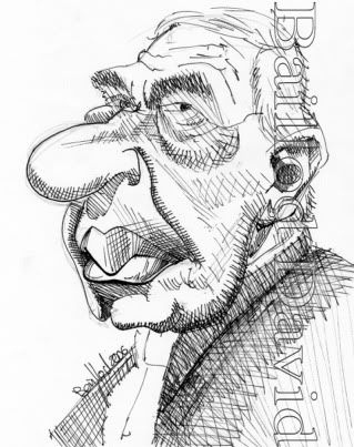
Here's mine:  |
|
devro
Junior Member
  ALL YOUR BASE ARE BELONG TO US!
Posts: 90
|
Post by devro on Jul 19, 2006 23:38:35 GMT -5
wow! great job, aardvark! It's got great likeness! Only thing I can suggest: That oval under neath his bottom lip is kinda outta place. I'm not sure what its sposed to be, but it distracts from the lips. Keep up the good work!
dev
|
|
|
|
Post by aardvark on Jul 20, 2006 1:37:45 GMT -5
wow! great job, aardvark! It's got great likeness! Only thing I can suggest: That oval under neath his bottom lip is kinda outta place. I'm not sure what its sposed to be, but it distracts from the lips. Keep up the good work! dev Thanks for the feedback. Not all of them turn out this well.  As for the oval under the lip, it was supposed to be his chin. It looked fine to me..... until you pointed it out. Off to fix that! |
|
devro
Junior Member
  ALL YOUR BASE ARE BELONG TO US!
Posts: 90
|
Post by devro on Jul 20, 2006 5:15:41 GMT -5
Keep practicing. They soon all will
dev
|
|
|
|
Post by bidgis on Jul 20, 2006 5:50:21 GMT -5
ok. here is my go !  |
|
devro
Junior Member
  ALL YOUR BASE ARE BELONG TO US!
Posts: 90
|
Post by devro on Jul 20, 2006 11:57:30 GMT -5
I like the line work as well, but I do not see ariel in it. Its a really good job, but I would not have been able to tell were it not mentioned. I am trying to figure out why i dont see him, but I can't. Sorry.
dev
|
|
|
|
Post by horate on Jul 20, 2006 17:16:02 GMT -5
Aardvark nice drawing and good likeness.
Bid i also don`t see Sharon but the style is nice...i think that sometimes we try to exagerate something wrong, so a good tip is to watch calm the photo ref,...and try to imagine as a caricature before do anything.Then begin to draw, ....only my opinion.
i begin drawing eyes or nose trying to give some good likeness, the rest can be more exagerated.Mouth is also a very important point to try to do with good likeness, but exagerating the expression.
A good tip for beginers is to made the skecth like a portrait, then, calque it making adding some exagerations.And the other thing is that for me works better to draw with some distance from the paper, using the pencil as a stick.Maybe it can aid.
|
|
|
|
Post by aardvark on Jul 20, 2006 21:36:40 GMT -5
OK, so after some advice, I made a couple of changes.  There's some good work out there. I'd offer some feedback, but since I'm only new at this, it'd probably be like telling you how to suck eggs. (Do they use that term anywhere else in the world??) |
|
|
|
Post by horate on Jul 20, 2006 22:26:59 GMT -5
suck eggs ?? here in Chile is the same term,....hehehe
|
|
devro
Junior Member
  ALL YOUR BASE ARE BELONG TO US!
Posts: 90
|
Post by devro on Jul 21, 2006 1:31:07 GMT -5
Much improved! I think thats one of your best!
dev
|
|
|
|
Post by chrisneuenschwander on Jul 26, 2006 21:06:14 GMT -5
quick sketch that I decided to color...  -Chris |
|
|
|
Post by jong on Jul 27, 2006 7:45:14 GMT -5
bid and frank, you guys have awesome style but i think you missed the likeness. tooned, good likeness and very funny as usual! lightshifter, the first is probably the best. one thing you're missing is the little v-shape in the middle of his upper.... i think that's one thing that took away from the likeness from frank's.the line that separates his lips isn't a straight line. horate, even though yours is very loose and scribbley, you managed to get a good likeness! good job.  aardvark, yours has a great likeness. it could use a bit more exaggeration, like the different eyes(one is more open than the other), but you'll get the hang of exaggerating soon enough. chris, great likeness, and very funny!   representing the eyebrows with a thin line looks weird though. |
|
|
|
Post by horate on Jul 27, 2006 10:08:42 GMT -5
Chris very nice the drawing and colors, well resolved the eyes expression.
|
|