Peter
New Member

Posts: 36
|
Post by Peter on May 9, 2006 5:44:20 GMT -5
Nice job Mak  |
|
|
|
Post by makarand on May 9, 2006 9:22:00 GMT -5
Thanks tooned and Club I appreciate your comments.
Makarand ;D
|
|
|
|
Post by chrisneuenschwander on May 11, 2006 20:01:17 GMT -5
okay, heres my go...but before I show it, Im going to tear it apart... first of all, I dont like it...I feel like I took 20 steps back and MAYBE one step forward, bu tits a flat, uninteresting peice that really doesnt come across as Mick Jagger. I had a vison for the drawing, whcih I feel my sketch portrayed, but my visons are greater than my ability at the moment. the wrinkles were handled weakly, the only thing I really like abou this peice is the swirly motion going on in his hair and to the left of his eyes, although I had greater Ideas for the wrinkles...like I said I handled it weakly. A little after I started, I decided that I didnt like the drawing and basically started scribbling. I was determined to finish this because I havent participated in the challeges lately...I say all this to get better, so other artist, let me know how I can improve...regain those 20 steps I took back and maybe allow me to go a few more forward...  I might regress to just graphite for a couple peices, because if im not satisfied with my basic drawing abilities...how can I expect to be good at drawing in color... -Chris |
|
|
|
Post by tooned on May 12, 2006 0:16:31 GMT -5
Chris dont be so hard on yourself.this is a learning drawing.i am sure you will learn from it.I agree with what you have said.missing the Mick look.I like the wet look of the teeth.
Its still a prety cool drawing.
|
|
|
|
Post by toonMom on May 12, 2006 4:52:48 GMT -5
I noticed the teeth as well, nicely done. The skin coloration is really nice as well. Just remember, there are no failed drawings... they are all stepping stones to get us where we want to go.
|
|
Peter
New Member

Posts: 36
|
Post by Peter on May 12, 2006 6:18:25 GMT -5
Chris - Whilst I agree your pictrure is certainly not instantly recognisable as Mick Jagger - it is still a very nice piece of work. As for being hard on yourself - we are all our own worst critics - if we weren't we wouldn't improve eh? Personally I feel you are young with an abundance of talent. I on the other hand am not so young or as talented so go on give yourself a hard time!!!!! ;Dt
|
|
|
|
Post by tooned on May 12, 2006 10:37:43 GMT -5
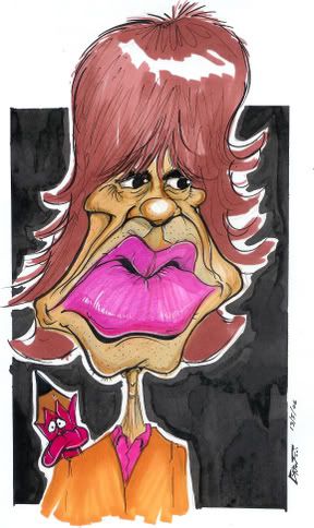
Ok here is my go  |
|
|
|
Post by jong on May 12, 2006 18:55:53 GMT -5
chris, if you cropped off our left side of the drawing (if you made a line from the middle of the hair on the top of his head all the way down) it would look really cool! just an idea. taking that part off imo would greatly improve it. when i cover that part it looks a lot like mick jagger and looks like an excellent piece of artwork. i think you've got the likeness in the features. i really like your colored pencil work!
|
|
|
|
Post by robincrazy on May 12, 2006 21:35:54 GMT -5
I'm on!...  RC |
|
|
|
Post by horate on May 12, 2006 22:11:16 GMT -5
Robin this one i think is very very unlikeness of Mick.too fat.....the style is cool but, the result is not the best.
|
|
|
|
Post by chrisneuenschwander on May 12, 2006 23:39:40 GMT -5
Tooned, still those watercolor markers? okay, I mighyt sound ignorant, but I bought a set of those, and no matter how hard I try, I cant make it look smooth...whats the process you use to color? is it just marker to paper? or is there something Im missing...out of curiosty...whats the name of the color youre using for skin tones? I like it alot! RC, I like your bold style. Thanks all for the comments, I shall move on! I did a quick 5-10 minute sketch...very rough...but out of curiosity...how do you feel on the likeness of this one?  -Chris |
|
|
|
Post by tel5521 on May 13, 2006 0:18:30 GMT -5
There's some ripper Mick's here guys - here's my entry went for the mild exaggeration but with a bonus neck & shoulders this time ;D  |
|
|
|
Post by tooned on May 13, 2006 0:28:21 GMT -5
Chris the markers i use are not water color ones.I Im not sure what kind they are.They cost about $5 each.The one i use for the skin is cream.I just played around with them.tried the cream and liked it.
Terry you are reaching new heights with your work.really is isnspirational.
|
|
|
|
Post by robincrazy on May 13, 2006 9:37:43 GMT -5
Thankyou Horate, you're right looks kind of fat. Looks better now, like this...:?  |
|
|
|
Post by toonMom on May 14, 2006 18:32:43 GMT -5
There is some really great stuff being posted in here. Tel, I can't find words to describe how I feel about your work lately. You have really stepped it up. Robin, love your style. Tooned, your coloring is really getting good.  |
|