|
|
Post by dmcaricature on Jun 12, 2005 12:58:20 GMT -5
this is terrific stuff all round. Great learning material.
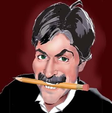
Mikey: you're capture of Freeman is outstanding,
thanks for sharing your technique
Hans and Dave well done...
the program looks interesting
Larry somehow it appears to me you have missed a likeness. I can see mine needs work too...
|
|
|
|
Post by dave on Jun 12, 2005 13:49:15 GMT -5
Hans- I was really struck by the composition and cropping of that drawing; if you want to use them for blowing your nose into after they're scanned, then fine.  Yeah, Mikey, I really love the color and lighting effects you got on his face: well done |
|
|
|
Post by dedder on Jun 12, 2005 13:55:58 GMT -5
The page is only A4, so for blowing a nose my size.......
|
|
|
|
Post by Larry on Jun 12, 2005 14:32:36 GMT -5
Larry somehow it appears to me you have missed a likeness. Thanks DM, I agree. If I got anything at all correct, or almost correct, I would say it is the nose. Of the last drawing, I would say it has more of a caricature look than the first two, so I guess that's a good thing. I'll just keep on plugging away. |
|
|
|
Post by lightshifter on Jun 13, 2005 10:48:22 GMT -5
Here is my first try at Freeman, Trying now just to get a likeness before goingo to Caricature. Boy do I feel like a duck out of water on this one. 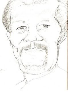 |
|
|
|
Post by lightshifter on Jun 13, 2005 10:55:29 GMT -5
Here is the second one trying to get a likeness before caricature. Better but not there. 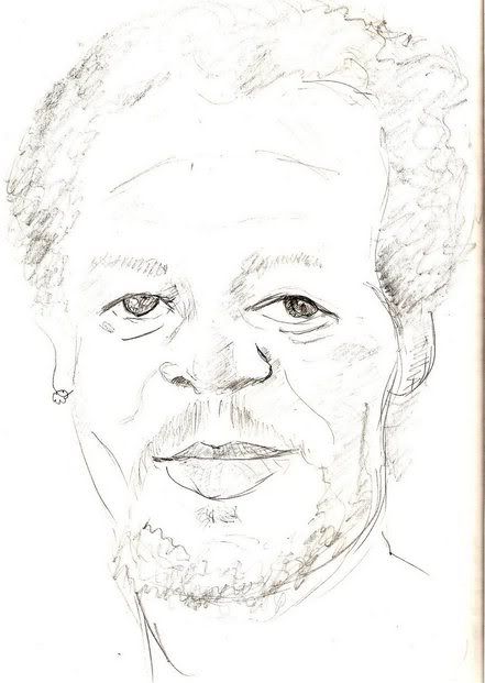 |
|
|
|
Post by lightshifter on Jun 13, 2005 11:05:18 GMT -5
Ok, Here is the third try, may br going backward. 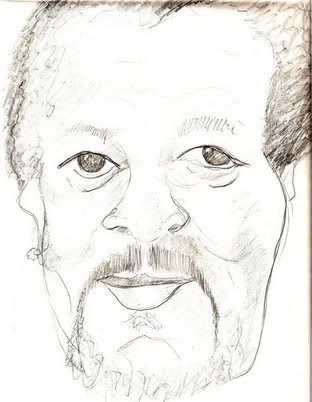 |
|
|
|
Post by lightshifter on Jun 13, 2005 11:06:48 GMT -5
Although I feel like I'm running in mud I think this workshop concept is great. Asuper learning process.
|
|
|
|
Post by dedder on Jun 13, 2005 12:55:48 GMT -5
You're improving,the likeness is coming on the right(ours) side of the face.You can make a mistake by wanting it too much to work.I suggest you loosen up.Maybe start very light, so little adjustments can be done quickly,without ruining the drawing.You can gradually deform or correct features,and when happy,draw harder,giving a more final result.
|
|
|
|
Post by Larry on Jun 13, 2005 16:44:00 GMT -5
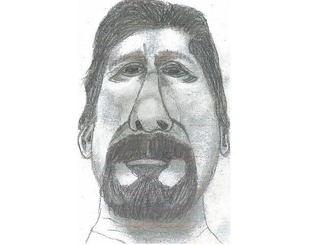
Larry, I would make the eyes bigger,the upper eyelid a bit slanted,and hanging over on the sides. Hans, thanks for your suggestions; don't know how I missed them when you first posted your reply. Anyway, I went back and tried to incorporate them in my drawing. I also changed some other stuff in addition to your suggestions. I'm afraid I'm still not getting a likeness. Not only that, but now the caricature-look is gone too! The drawing's been erased too many times now; I think I'll have to start from scratch, but here it is anyway. 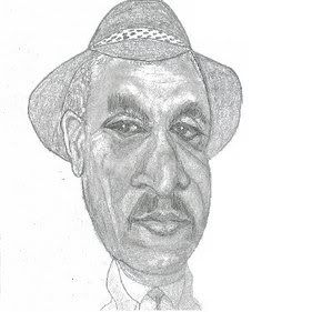 |
|
|
|
Post by lightshifter on Jun 13, 2005 17:04:19 GMT -5
Thanks for the tip, I'll Keep trying.
|
|
|
|
Post by dedder on Jun 14, 2005 7:34:35 GMT -5
Her's mine,had some trouble with it,because the eyes were not lined up as they should..Didn't notice in the first sketch.. I may need to place the coat more in the shade ,don't know if I will though...worked too long on it as it is now..  |
|
|
|
Post by lightshifter on Jun 14, 2005 8:30:25 GMT -5
Here is my start at the caricature of Morgan Freeman. 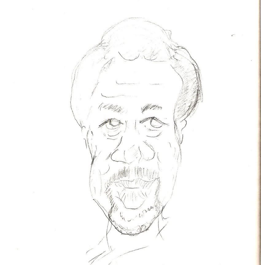 |
|
|
|
Post by lightshifter on Jun 14, 2005 8:31:46 GMT -5
I like yours Hans, but d**n it is scary.
|
|
|
|
Post by dmcaricature on Jun 14, 2005 9:14:38 GMT -5
lots of good attempts at Morgan. I feel Mikey has nailed him! Lightshifter just keeps on trying! still not quite there....the second sketch has his eyes in my opinion. Larry: your rendering skills are really looking more 3d. the likeness is still off ( my humble opinion) Hans: The master of rendering. I can't pinpoint it but I think his nose needs more prominence. sometimes the more time we spend on these things?  |
|