|
|
Post by dedder on Jun 9, 2005 13:26:15 GMT -5
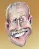
Let's get this thing started. These are the two pictures I found most intersesting,for bigger sizes ,Google them up.(mark "large" on the top right to get only bigger sized pictures. I would like (for me) to have a caricature with the hat,like the first picture.The second picture gives a typical expression for the man, in my opinion.   |
|
|
|
Post by dedder on Jun 9, 2005 13:37:59 GMT -5
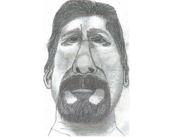
So, I took my leadholder, and very fast drew some rough lines,and shadings,to find what I was after,like I said in the first post,I want this typical look.quickly added some shading...too quickly as it turned out,but we're posting ALL pictures... But it looks like nothingwith half the head chopped off.I found some pictures of him without the hat,but I think it's more 'him' with hat.  So then I saw it could make a nice picture.I took another page ,and drew a first try, to make a caricature.I kept the previous next to me, as some sort of guidance. it's starting to look like him,but this is not a 'hans'caricature,I want more.  So now, without reference,and VERY light pencillines,I draw the guidelines for the next try.No reference? No, just the previous sketch, a caricature of a caricature, that's how I found these deformations. At the moment,I'm happy with it.....Tomorrow I might think otherwise. What do yo guys think? What's there to improve,or to change?  I'm looking forward to seeing your caricatures. No need to follow my way of working,..find your way. Everybody will help you out, when things are not exactly what you planned.. |
|
|
|
Post by dmcaricature on Jun 9, 2005 13:51:41 GMT -5
okay drawing 2 appears to have his eyes correct. Drawing 3 loses some of that and he tends to have an almost Asian look. this is a great approach a good learning tool
|
|
|
|
Post by donpinsent on Jun 10, 2005 6:56:16 GMT -5
yeah, i think i'd agree about the eyes. although i will also say i wouldn't have noticed it if dm hadn't said anything, so the likeness must still be there as it is too. my only problem with it is the tiny pupils/irises. not that they should be huge, but just bigger than they are. nice facial muscle structure, though not quite as symmetrical as i might prefer.
|
|
|
|
Post by toonMom on Jun 10, 2005 7:05:17 GMT -5
Here's a quick one from me, although I'm not happy with it. We post all here right? 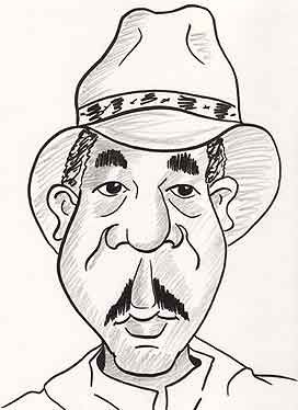 |
|
|
|
Post by dmcaricature on Jun 10, 2005 7:36:00 GMT -5
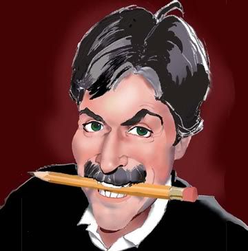
These two quick sketches are my first working sketches of Freeman. I am simply responding to the structures of his face as I see them. I see his nose as very prominent. I am downplaying the lip size and chin. I kind of ran out of paper for the top of the head and in a future sketch I hope to flesh out the hat and brim. I can do many quick ones like this with the intent of trying to capture what I think works. (don't we all)...once I get a good direction I try to create more dimension with shade and so on. I like dark hb pencils sometimes 6-8b (unlike mr Dang's 2h).. I hope to work this up more and will post to show my progress.  |
|
|
|
Post by dedder on Jun 10, 2005 12:05:50 GMT -5
DM: on my drawing, I was after that "predator" look.Like the way you can see a lion look ,or a cougar or whatever.Maybe widen up the irises to emphasize that.He looks from under his eyelids.
Don :you're right on the symetrical thing and the irisses.I will correct that.
Toonmom: nice drawing,but what strikes me first is the hat, the top piece of it is too wide,it's only as wide as the head.His face is at it's widest on cheekbone-height, not at jawbone height.Yes, you post here,every drawing,so you will see yourself improve,or correcting.
DM:In your drawing ,I would shorten the nose,it's a big thing,but mostly wider than it's long.He needs more flesh also, he looks too skinny.
Thanks for joining in.I really appreciate it.
|
|
|
|
Post by dedder on Jun 10, 2005 12:47:46 GMT -5
I made some adjustments to the sketch.I'm quite happy with it.Th shading proved me right, allthough the scan of it is horrible.I think I'll stick to this one.  |
|
|
|
Post by dmcaricature on Jun 10, 2005 13:44:57 GMT -5
Hans: good valid points on all accounts. When I get a chance I will try and incorporate and refine....yes he needs some cheekbones and fleshing out. good stuff. on yours, check out the size relationship between the top and bottom lips. ha ha caricatures by committee  |
|
|
|
Post by Larry on Jun 10, 2005 16:15:56 GMT -5
Here's mine; fire away! 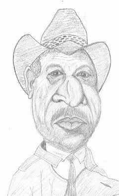 ...and after looking at it again and again, here it is again with some changes to the top lip, mustache, and particularly the width of the face in the area of the cheeks. 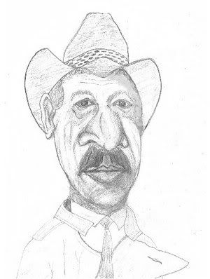 ..and this is where I'm at with it right now: 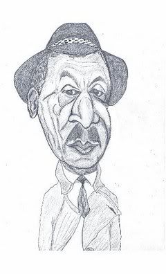 |
|
|
|
Post by Mikey on Jun 10, 2005 18:39:13 GMT -5
A fun project! Looking forward to seeing everyone's take. I'm including a different photo ref. I think it catches his look better.  The next is a scan of my first pencil sketch, (regular #2). No photoshop touch up whatsoever. That explains the lightness of it. The original actual figure is 8 inches tall on a regular sheet of copy paper. The size has been clipped to fit the sketch.  after scanning it into photoshop. I click: Image/Adjustments/Autolevel this produces this  There are several changes I immediately want to make. His right eye is not placed right. I concentrate on the shapes of what I prefer to call "Masses" rather than bone or muscle structure, because they are actually combinations of both of these along with the skin, etc. I'll check it now for proportions, and trying to catch his special characteristic smile and other key features.  The one above. I start adding my deepest shadows. I fixed the right eye some. I may make his eyes bigger also.  This is where I've started adding the color and enhancing features The next scan is a close up. By the way. I work at 200 DPI on most 8-1/2 x 11 inch drawings. When I save them to photobucket I keep the resolution and make them 2 inches high for this presentation. Generally they are 2.7 inches high.  OK ... Ya gotta know when to stop. There's a lot more I could do, but ... well this post is getting too long for me.  Hope this helps some. Mikey |
|
|
|
Post by dedder on Jun 11, 2005 12:21:28 GMT -5
Mikey:This is a great one.I agree on making the eyes bigger,but it's not a must.It's a good one. Looking forward to seeing some colors Larry, I would make the eyes bigger,the upper eyelid a bit slanted,and hanging over on the sides. Been testing my new toy: Artweaver, as said elsewhere on this forum 100% freeware.( www.artweaver.de/index.php?en_version) It has some child-deseases,but some comercial programs can begin to watch their backs.. THis program supports layers,tablets you name it.... maybe I'll continue in this program.(if I can figure out the keycombinations)  |
|
|
|
Post by dave on Jun 11, 2005 15:49:01 GMT -5
the first thing i noticed was that the eyes and brow seemed a seperate piece that fit down into the cheekbone and lower structure, so i started it off with that in mind, but i think i'll try to exaggerate that some more. Hans, since you seem dissatisfied with your very first drawing, will you autograph it and send it to me? i love it!!!!! 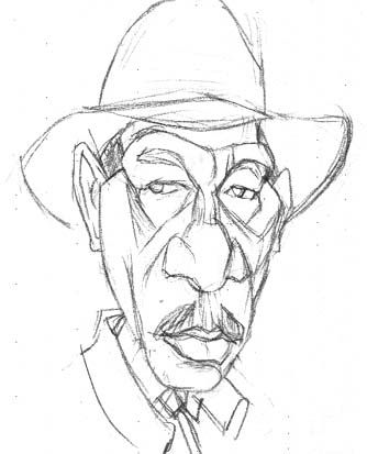 |
|
|
|
Post by Mikey on Jun 11, 2005 16:20:10 GMT -5
Oh wow! A flash back.... I took what I did, made a copy, did some guey stuff in photoshop, posterized it ... and Wow ... Jimmy Hendricks is not dead! ;D  Mikey |
|
|
|
Post by dedder on Jun 12, 2005 11:02:23 GMT -5
Surely you're just joking?
There's nothing remotely to what I would normally show to anyone.I just did to give everyone an idea of how I go about things.
There's another thing,....I never keep those drawings,I tear them off to scan,and after that, they go in the box,together with newspapers,publicityfolders and so on.I managed to rescue it,but it's fold in two....pitty.
|
|